Braille is widely used by people with vision impairments, but despite widespread improvements to accessibility on the web and smart devices, innovation for braille-reader hardware has essentially been stalled. Dot has taken a huge step forward with a smart braille device that not only allows for easy display of text, but tactile representations of imagery, potentially opening an entirely new layer for education and accessible content.
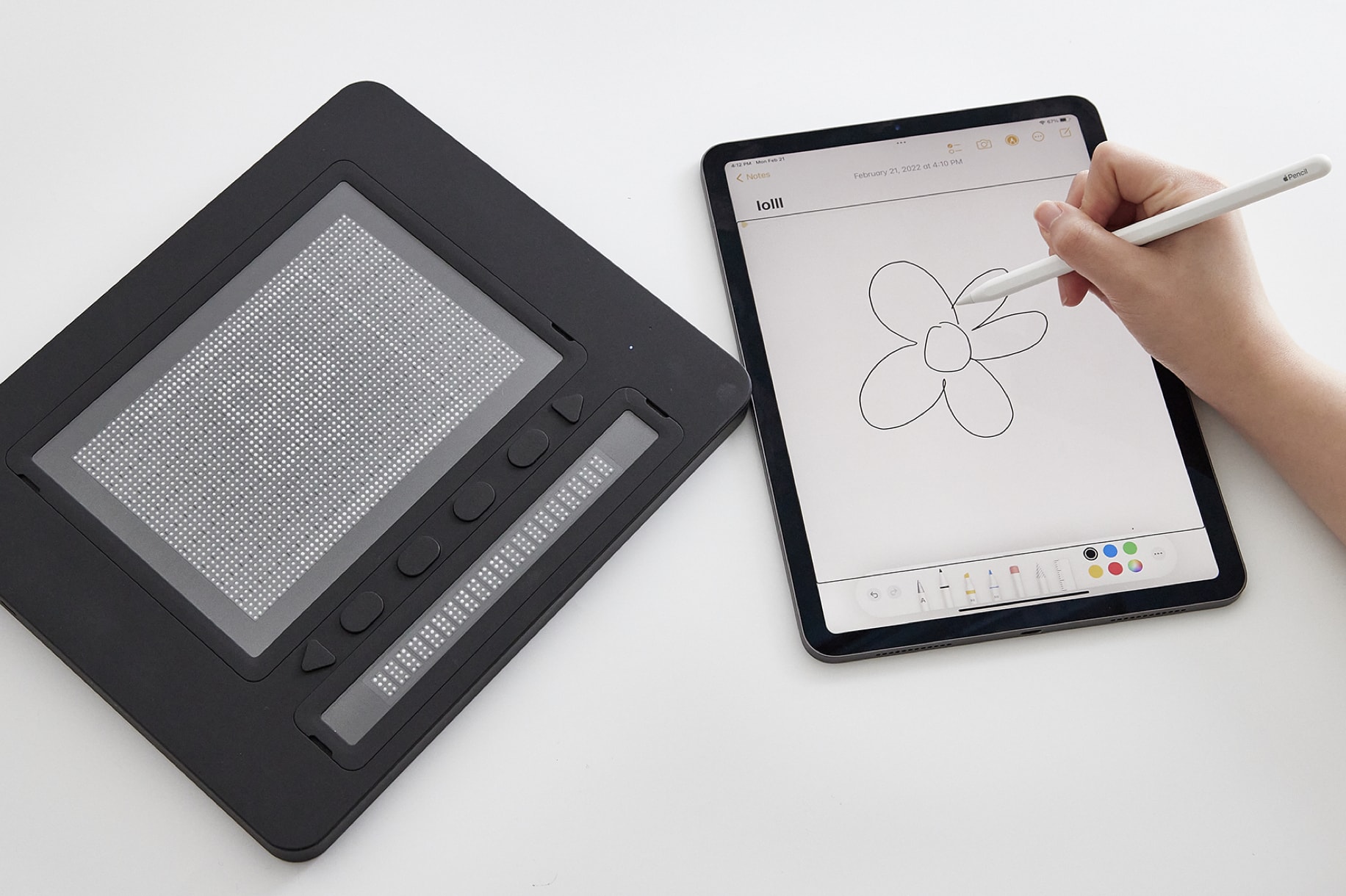
The Dot Pad consists of 2,400 pins in a pixel-like grid that can quickly be set to be in up or down positions, forming letters in braille or easily identifiable shapes. That’s room for 300 braille glyphs, plus 20 more in a more traditionally spaced line below. Crucially, the device also integrates directly into Apple’s VoiceOver screen reading feature, making reading text, icon labels and even graphs or simple images just a tap away.
The company, based in Korea, was formed when co-founders Ki Kwang Sung and Eric Ju Yoon Kim found themselves fed up with the lack of options for learning and reading despite so many other advances in computing and interfaces.
This isn’t the first digital braille display by a long shot — devices like this have existed for decades, but they’ve been decidedly limited in both quantity and capability. Most commonly you’ll find braille displays for reading and typing digital text, but these are often comparatively clunky one-line machines that haven’t fundamentally changed in many years.
These devices are also generally not created with kids and learning in mind. Children with visual impairments are subject to a number of systematic disadvantages, such as a lack of textbooks or activities created with them in mind. It’s this lack that led the parents of one such kid to create the BecDot, a toy that helps teach braille at the toddler level.
(After this story was published, the American Printing House for the Blind pointed out that development on traditional braille readers has continued and new devices, including some with learners in mind, have been released. But the general design and interface is familiar.)
“In the 21st century, it didn’t make sense that visually impaired people cannot access graphical information in a digital way,” said Sung. “There are a lot of innovations out there in every industry, including education, jobs and social network services… the requirement of graphical information is getting higher, which means visually impaired people are getting cut off. Even in the pandemic situation, remote work and education was mandatory… but they didn’t have any solution to do that.”
They decided to make a monitor to allow blind and low-vision users to access and interact with the pixel-based images and representations sighted people take for granted.
Image Credits: Dot
Braille readers are generally extremely complex mechanically, relying on hundreds of tiny hinges and gears to raise and lower the pins on demand — and they must also be robust enough to withstand constant pressure from touching. We’ve seen various innovations over the years from prestigious research institutions, but none have really made it to market. Dot is trying to change all that with not just better, more capable hardware but also deeper integrations with smartphones and tablets.
The core innovation of the Dot Pad is, as you might expect, the “dot” itself. How to make dozens or hundreds of these little pins (6 per braille letter) extend and retract reliably and quickly (and not too loudly) has produced a variety of solutions, but Dot’s is entirely new.

Image Credits: Dot
“We got the idea from the mechanism of speakers,” Sung explained. The tiny electromagnetic actuator vibrates in smartphone speakers but the team adapted it to move a pin up and down instead, using a magnetic ball rotor that locks easily in the up or down position and can unlock and disappear quickly. The whole thing is a fraction of the size of previous mechanisms — “10 times smaller compared to existing piezoelectric braille actuators.” (Dot privately showed me schematics and cutaways of the pins that showed how it’s done, but declined to share those publicly.)
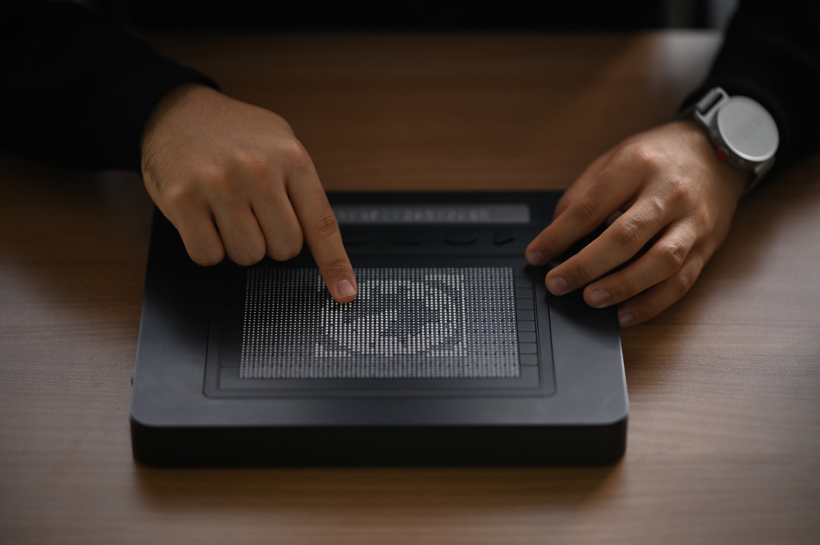
This means the company was able to create a grid of thousands of pins with very little space between them, big enough to be read as letters but also dense enough to form patterns representing images. The bottom of the Dot Pad has a dedicated section for traditionally spaced braille but the main grid is better described as a “tactile display” than anything else.
I got to play with a pre-production prototype device and it worked very well, refreshing the whole screen in about a second from top to bottom (this is being improved as well, to the point where animation is a possibility) and seemed readily scannable by a user’s hand. Both displays have a flexible protective screen that prevents the pins from getting gummed up and can easily be swapped out. The cells themselves are easily replaced as well.
The other big advantage Dot has is its collaboration with Apple. The Dot Pad can be invoked with a gesture, instantly showing whatever the highlighted item is on the display. You can see the process in action in the video below:
And there’s a new “tactile graphics API” for developers in iOS 15.2 that will let them include and tweak this capability in their apps. (I’ve asked Apple for comment on the API, and will update this post if they reply.)
“Many blind/low-vision users around the world rely on iPhone and iPad, due to the industry-leading screen-reader VoiceOver,” said Kim. “We are very excited that Dot’s tactile technology is now optimized for VoiceOver, and that this will expand digital accessibility. Beyond speech or literary braille, these users can now feel and improve their understanding of images.”
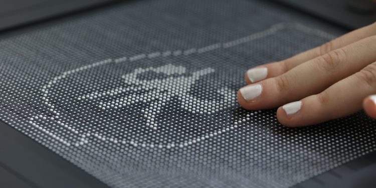
Obviously the fidelity is somewhat limited, but it can display icons, line drawings and things like graphs very well. Imagine a graph in an article about stocks — sighted people can take it in at a glance, but others must find other ways, like the one built into VoiceOver that represents the graph as a sort of rising and falling tone. Better than nothing, but definitely not ideal. The Dot Pad, powered by VoiceOver and its own image analysis algorithms, will attempt to represent any screen area or element on the display.
Text can also be represented, either as a full page of braille letters (arranged in spaced rows like normal) or as the shapes of the letters themselves. This allows the user to better appreciate things like typefaces in logos — there are no serifs in braille, naturally. Actually, it sounds quite interesting to experience large-scale type in that tactile way.

Image Credits: Dot
More importantly, though, this is a great resource for kids. A child growing up with a visual impairment misses out on a lot, and being able to easily illustrate things like letters, shapes and simple images others take for granted like houses, cats and so on… it’s potentially a game changing addition to K-12 education in the blind community.
Part of that is of course close integration with the most common devices out there, so it isn’t just a resource someone has under very specific circumstances. The iPhone and iPad are not just ubiquitous as modern digital devices go, but also have a robust accessibility stack that Dot has tapped into.
Of course the vast improvement to voice-powered interfaces has been immensely empowering for people who can’t use graphical interfaces, but braille remains an important option, especially for reading and learning. All these modalities and more must be improved so that opportunity is not bottlenecked by technology.
Feedback from the community has been positive; Sung said people have mainly been thinking about the possibilities rather than the limitations. But from the early stages they did increase the “pixel” count to better render images, and they’re working on a library of Dot Pad-friendly custom graphics so that if, for example, the Twitter logo is recognized by the software, it can just use its own version rather than scanning the outline every time.
Dot will be making their core tech available for an upcoming Dynamic Tactile Device project led by the American Printing House for the Blind and HumanWare, slated to be launched in 2023; the developer community will have a chance to weigh in based on their experience with the API.

Image Credits: Dot
Future feature plans include tactile representations of photos — not necessarily the images, but the layout, the positions and descriptions of people, and other aspects could be put on the display. They’re also working on a way to lock the pins at middle heights, for gradations in feel and other uses. And potentially the pad could be used as input as well as display — being able to press down on the pins to send a touch signal to the appropriate part of the screen would be yet another useful feature.
Of course, like previous braille displays, the Dot Pad is neither cheap nor simple — though it’s potentially cheaper and simpler than others out there. Manufacturing and assembly is no easy task, and the total cost is difficult to say, especially with inflated prices for chips and other components right now. (It uses thousands of tiny ICs that previously were mainly used for car window control switches — and prices right now are through the roof.)
Fortunately, this is exactly the type of device that no one should have to pay for, and for which there are numerous subsidy and other programs. After all, kids don’t have to pay for necessary items like the desks they use at school. And helping people with disabilities get a good education is in everyone’s interest. Better accessibility is of course welcome for its own sake, but it has major knock-on effects, as people who couldn’t learn or participate in an industry finally get a chance to.
Dot’s founders noted that they’re working with the Korean and U.S. governments, as well as the blind community and advocacy organizations to integrate the Dot Pad with curricula and use existing funds and methods to pay for them. Developers can learn more about the tactile graphics API here and at Apple’s developer site here.
Source by techcrunch.com

